Going in line with my next monthly special, I thought I'd talk about brand identity and brand quality control. I see it far too often and feel as if not many people know the true importance of brand quality control or even fully understand it.
So, you have a logo that strongly represents your company and you've invested a lot of time and money into it. However, all your collateral and advertising showpieces that represent your company are inconsistent. Your colours don't match, your logo is fuzzy or has been stretched, you're using a serif font that looks similar to Times New Roman. No offence! Your brand is not speaking with one voice which can lead to doubt, distrust and lack of confidence in the quality of your service or product.
Here's a few steps you can take to make sure your identity stays consistent.
Getting the right logo versions and variations from your creative supplier
I really like to think this happens automatically when receiving a completed logo but unfortunately it doesn't. Upon logo completion you should receive print and digital versions in every possible iteration. Here's a breakdown:
Print version – these files are saved in CMYK (4 colour process made up of Cyan, Magenta, Yellow and Black) or PMS (Pantone Matching System).
Digital version – these files are saved as RGB colours to reproduce correctly when displayed on screen.
One-colour version – generally changed to all black or shades of black and saved in a grayscale format. This is good to use in printed products that aren't in full colour.
Reverse version – this is typically a white version of your logo that can be placed on any dark background. It will come in either a PNG or vector file with a transparent background.
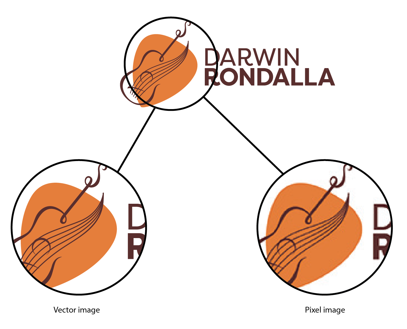
Multiple formats – Within each of the versions listed above, these should come in multiple formats. Overall, there are two formats; line art and pixel based images. Pixel based images (JPG, PNG, TIF) are made up of pixels and WILL become pixelated once stretched over it's originally saved size. Line art files (EPS, AI) are made up of straight and curved lines and can be down-scaled or up-scaled without changing the original displayed quality. Here's an example:
Get a logo style guide or brand guidelines
This too is often included at the end of a competed logo. This is a compiled document outlining the do's and don't around your brand identity. It will include colour breakdowns for print and digital, typography standards, and examples of how the logo should look in application. Brand guidelines are typically used within much larger companies and will outline brand strategy and story, company values, missions and samples of designed work.
Where to go now
If you have an exisiting logo and would like to align your branding, get in contact with a creative personnel or make sure you ask for these requirement upon completion of your logo design.

